January 03, 2021

Keyboardio Atreus: First Impression
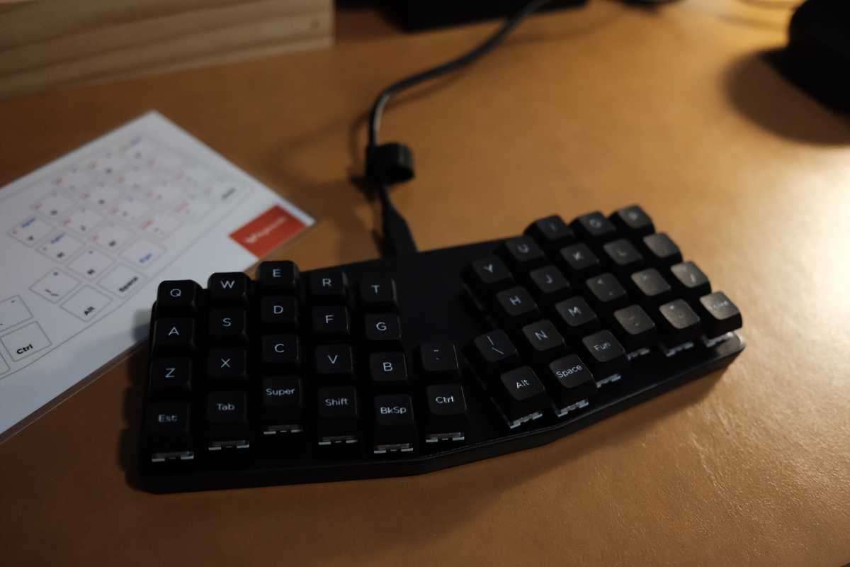
The Keyboardio Atreus.

Oh boy. I knew this was going to be a hard one, but wow, was I off by an order of magnitude.

First off, the Keyboardio Atreus is an itty-bitty little boi. I’m coming from a 70-ish percent keyboard which uses a split and staggered layout (aka the Microsoft Sculpt Ergonomic Keyboard). The Atreus feels a quarter of the size… which feels unbelievable but it’s true.

When I first moved from a “normal” keyboard to that, I had to suffer through a number of bad habits I had built up over the years, the worst offender being how I typed “b” with the wrong hand. Having been through that cycle once, I figured the only struggle I would have was to learn the new layout and function layers. Before I can even explore those issues, I am being murdered by the “c” key (“funvtion” anyone?) and the “z” key. Apparently I have been typing each with the wrong finger.

The Atreus layout is going to take a good long while to get used to for every day situations. Typing this “first impression” post has been okay but certainly a trial. (For anyone wondering, I opened the box, plugged in the keyboard and started pounding out my initial feelings right away; I will update as I get more use out of it.) Typing all of the letters, except the ones I have already mentioned are fairly natural feeling and surprisingly the space button aligns exactly with how I type. Less so with the default layout’s “backspace” (so many c’s 😢), “shift” and “super” keys. My left hand is going nuts trying to figure out the proper sequence. So far, the pattern feels to be a wild swing-and-a-miss with my left pinky trying to hit the “shift” and when I realize that’s not right I wildly stab around with my thumbs. Annoyingly, in Gnome (my current desktop environment on Linux) hitting the “super” key causes the search to take over the entire screen, so for anyone watching over my shoulder would be treated to quite the disco show… a show which is making me a little motion sick if I’m honest 🤢

I am going to stick with the default layout for the time being, to try and get a sense for how it was meant to be used before customizing. Thankfully, Keyboardio include a little laminated card with the default keymapping, which I am going to keep taped to my monitor. Looking at it now, I shrivel in horror looking at the placement of the brackets on the first function layer. The first coding sessions are going to be horrible until I figure this all out.

Quick update: typing numbers is painful… typing out the date 8 numbers and two hyphens took at least 45 seconds 🤣

I wrote a few questions I had before ordering the Keyboardio Atreus in a post and I hope to answer those in the next few weeks/days. If you, dear reader, have questions please feel free to send them my way.

TabFS

This looks really cool. Script a way to copy all of your tabs, copy tabs based on matching text, etc. Though, I worry that as a card-carrying tab hoarder I might cause my system to swap if I mounted all my currently open tabs 👀

(H/T Andy Baio)

Syncing a Fork with Upstream on Github

So, here’s a bookmark-as-a-reminder to future me. I was contributing to a little application called Curtail (nee ImCompressor) and in the time between forking the original project and submitting my pull request, the entire project had changed names, icons and the whole she-bang. I wasn’t sure if you could rebase a fork off of upstream on Github, but it turns out you can fairly easily through the commandline (I couldn’t find a way to do the same through the website).

In short, fire up a terminal, then:

1.) Set a new remote as, say, upstream

git remote add upstream https://github.com/USERNAME/PROJECT

2.) Fetch any upstream changes

git fetch upstream

3.) Merge upstream changes with your current branch

git merge upstream/BRANCH

4.) Profit?

January 01, 2021

Year of the Field Day

I figured out my direction for the new year!

This year will be the, "Year of the Field Day." On its face, not terribly snappy; I tried looking for synonyms, nothing I found managed to convey the right feeling. So it’s sticking around.

Field Day (n.): a time of extraordinary pleasure or opportunity

This theme is born out of last year’s theme of clarity. Now that I have a better handle on some aspects of my life and a clear(ish) direction into the future, it is time to enjoy myself. I want to rebalance my life a little bit, focus on a few hobbies and enjoy the fruits of fortune that have fallen into my life.

In no certain order, I'd like to spend more time:

  • Blogging and investing more time here into my “homestead
  • Trying a new content medium, like podcasting, streaming, or video
  • Contribute to more open-source projects (ideally at least one on-going collaboration, rather than the few drive-bys I’ve made this year)
  • Building little apps and side businesses based on interest, not monetary value (I’m really interested in helping create community first businesses or sustainable relationships between creator and community. If you see yourself in any of those words, reach out! I’d love to chat.)
  • Taking more photos and exploring the world of photography
  • Getting stronger and bouldering more often (COVID permitting)

I’ll be fleshing these out in more detail as I embark on each piece, but for now it feels better to get this out into the world.

Stay tuned 😉

January 01, 2021

You Should Pick a Yearly Theme

Don't make a resolution for the year to come; you will either accomplish it or feel guilt ridden if your life takes a turn. Instead try setting a yearly theme. (A concept I've adopted after listening to the Cortex podcast with Myke Hurley and CGP Grey.)

A yearly theme works simply: it's a loose idea to gather up all of your successes across the year. Want to explore a new hobby, try new foods and line yourself up for a promotion this year? Fly under the banner of "Year of Exploration," the "Year of Adventure," or whatever you'd like. The theme only needs to be relevant to you.

A yearly theme is at once, lattitude to explore what you’re focused in on—without being directly tied to one and only one outcome—and, crucially, an opportunity to forgive yourself. It’s easy enough to jump from I missed this resolution, to I’m not worthy. If you’re anything like me, the lizard part of your brain has spent years looking for evidence to prove it’s conclusion… not the other way around. Do note the yearly theme doesn’t write off failures and learning opportunities to “only focus on positives.” Each theme is just an idea, they don’t dictate anything at all, you’re the one who gives it all structure and meaning. All we know is through the years of human experience, resolutions don’t work, don’t stick and don’t make you feel any better… though your experience may differ.

December 31, 2020

The Start of a Realignment

I’m realigning the site, making it easier to hack on, etc. My original goal was to use my holiday time off to do a full scrub and change the theme, mainly to open up the types of content I could post here. As with all good intentions, I’m starting smaller than my ambitions would like.

This site has jumped off Grav (a “flat file” CMS built in PHP) and onto Eleventy (a node-based static site generator). Grav is awesome, but I don’t work with it that often and because I’m not super familiar with all of the pieces, I find myself forgetting how things were put together and otherwise discouraged from working on the site. (Again, mostly past me’s fault for not documenting better.) I originally swapped over from a static site generator to Grav I could have access to a server rendered administration interface on mobile. But honestly, I stopped using it after I found a way to jerry-rig an automation script on my phone to post directly from a markdown editor via iOS’ Shortcuts. A hacker to the end, I guess.

Eleventy, if you’re into a bit of development and happen to be a JS oriented person, is a boat load of fun. It’s easy to hack on, the maintainer is a real force for positivity in the web world and at the end of the day it pukes out HTML, CSS and as much JS as you’re into (which could be none).

I also ran into some strange permissions issues that I could never permanently fix. This is what ultimately prompted the entire move to Netlify, which as it turns out was my real motivation, not a redesign or replatforming. Now, each change pushed to the site’s repository triggers a rebuild and pushes all of the assets to Netlify’s infrastructure/CDN. That keeps the site rendering quickly and reduces the amount of server management for me. Win-win as far as I’m concerned.

There’ll be more to come on the design and development front, but I just wanted to make note that the site is a changin’.

December 17, 2020

The Keyboard and the Blogosphere

I've been typing a lot and my left pinky has been getting cranky. An ironic case of "Emacs Pinky," (aka "Hitting Control so much your pinky hurts") since I am an avowed Vimmer.[1] As a person who lacks all constraint, I bought a new keyboard instead of adjusting my habits.

It's called the Keyboardio Atreus, which is an update to the Atreus by technomancy. It's a 40% keyboard so that means it's missing almost every one of your favourite keys and there's no key stagger so all the keys are arranged in columns that mirror your fingers. Supposedly, this is all for ergonomics, in truth it means my not-that-great touch typing speed is about collapse.

Looking online, there isn't much for information about the Keyboardio version, nor the previous one. The mechanical keyboard world isn't very wide but it is horrifically deep. I expected to find something to help get a sense for how it operates. Alas, beyond a few Reddit posts, the Kickstarter launch ad and a few super short videos, there's nothing out there to satisfy my burning questions.

I bought it anyway. I think it's a pretty handsome boi, but overall probably not the smartest decision I've made with my money.

All I wished I someone could have told me is:

  • How's the typing experience?
  • What was it like relearning to type on this doo-dad?
  • What are those middle buttons like? Are they reachable by your thumbs
    • Is it at all ergonomic?
    • Do you use it for work? Is this your only keyboard? (Less interested in people with 50 million keyboards who switch frequently, though that is pretty cool.)
  • How did you find customizing the layout and function layers?
    • Did you get into crazy modifiers?
    • How did you layout your keyboard? And Why?

Not anyone else's problem except mine, but things I learned which I could care less about:

  • This is what typing sounds like using my XYZ mechanical switch

The only thing I should actually want to know the answer to:

  • Will my partner (with whom I adore and share an office with) murder me for having ordered this?

I take for granted how awesome the hive-mind of the Internet is: I want to know something, I search, I find the information, I read it and move on. I've learned to simply forget that the Internet wasn't handed down to humanity, but was built by other meat-jackets like me. So I am going to turn my frustration above and try to do something productive with it: contribute back to the large, shared corpus of knowledge.

I imagine that's how most information ended up online, i.e., someone out there got so wound-up while doing a task, buying a thing, or whatever, that they vowed never to let it happen again and thus committed that knowledge to a Tumblr somewhere. A story as old as time. And a real shame that I haven't been doing more of it.

I pledge to solemnly blog about my goofy keyboard, to take a few pictures and who knows maybe make a video will be involved (or a stream? what do the cool kids do these days?), all for no other reason than I wish it had existed before I spent my time and money on this itty-bitty boi keyboard.


  1. Here's where I went wrong: I learned to type Ctrl + [ instead of escape when I tried programming on the iPad and the Smart Keyboard case didn't have an Esc key. Yes, I have tried swapping over my caps lock key to being an Esc key and at various times an additional Ctrl key, but no, I didn't have the discipline to make that habit stick, ergo, my hand hurts. ↩︎

Cloudflare Analytics

This should be interesting.

There are alternative means for collecting analytics besides Google's Analytics software but it goes without saying that Google is top dog here. I think that's probably due to being free and tightly integrated with Search which is what most internet properties actually want greater access into. Free and open-source alternatives for web analytics exist, they're decent choices but no one uses them beyond a tiny minority of folks (probably aligning pretty closely with the number of desktop *nix users out there 😘). Any other alternatives are paid. And there's no remedy to that latter reason, unfortunately. Google's search is great; more data is collected to make Search more accurate, which then maintains Search's dominance as the Internet search utility.

Cloudflare I'd bet has an opportunity to destabilize the Google's balance of power here, even if they come in a distant second. Unlike Google, their money comes from owning the infrastructure, not advertising and search. Cloudflare has the pockets for this kind of exercise and no incentive to get creepy.[1] The product can spread because it has most of what people need and the price is right. It also doesn't hurt to have a relatively trusted (among the people who maintain websites anyhow). Any success they gather keeps Google tracking and therefore Google's access to watch your behaviour at arms length.

Here's the thought experiment: What proportion of the Internet needs to use alternative, non-Google data collection, or no tracking at all to build a small wedge into Google's hegemony? If not a "herd immunity" threshold, what's enough of a percentage to destabilize the incumbent power and open up to competition?

This will probably not be interesting, but it could be. Something I think about any way.


  1. I'm not entirely convinced owning a sizeable chunk of the Internet's traffic through their network completely disqualifies them from being in the realm of "creepy," but I do believe that's only a consequence of their success. I don't have reason to fault their intentions. ↩︎

Npm Ruin Dev

The Internet's own Jeremy Keith penned a pretty spicy post on CSS-Tricks about writing a website without a build chain. A feeling that's likely to land at home for any agency drone whose had to update a gulp-based site after the v4 transition (it's me 🙋‍♀️).

Baseline rules, aka rules you follow until you reach an exception are powerful. I think starting as close to vanilla CSS, HTML and JavaScript as possible is a good idea. My only hesitation is that no matter where it lives, the complexity of setting up a build chain is waiting for you. And given the choice of swallowing the pain of configuring we pack up front (a generator probably does this for you), or in the middle of a project by hand, most will opt to follow the status quo.

The Better Packaging Co.

Being shut-in means more deliveries and more packaging, an unfortunate consequence of 2020. What I'm hoping to see more of in the future are companies, like The Better Packaging Co who are using advances in material science, to address a clear need for our planet. Consumer habits aren't going to change over night and perhaps vendors like this one, should it receive wider popularity, could hold us over until we all clue into better alternatives.

Mozilla Punts Servo Web Engine Development to the Linux Foundation

I'm not sure that Servo, Firefox's next generation browser engine, ever got its time to shine. They made big strides with Firefox's speed and developer tooling, but it's hard to know what was due to Servo and what was based on their previous Gecko engine. (I've heard third hand that most engineers were focused on Gecko prior to this split.)

Like their divestment of Rust (which was probably a good thing, many vocal open source advocates were concerned about Mozilla's stewardship of the project), this frees up Mozilla to work on other pieces of their ecosystem... like trying to figure out how to survive on their own, much to the chagrin of those committed to their cross platform, privacy oriented open-source browser. Hopefully the Linux Foundation can help the project find a new audience beyond Mozilla.

Hello: FreeBSD for “Mere Mortals”

Can we make an open source system that is welcoming to switchers from the Mac? Something that “just works” as intended, without the need to fiddle around much to get to a working desktop that does its job and otherwise gets out of your way? Say hello to hello, a desktop system for creators with focus on simplicity, elegance, and usability. Based on FreeBSD. Less, but better!

Though a comforting first thought, "hello"[1] will not be an OS X (RIP 😰) emulator but a new thing altogether. It only vaguely looks like earlier versions of aqua and promises to be more dependable. Certainly there won't be any Mac apps. You'll (I assume) be using native Unix applications, probably ported over from Unix's less license-lenient cousin Linux.

All that said, look at those screenshots and try telling me your not the slightest bit curious.

Here's a link to the project's repository.


  1. Good luck Googling that! ↩︎

What is this Place?

This is the weblog of the strangely disembodied TRST. Here it attempts to write somewhat intelligibly on, well, anything really. Overall, it may be less than enticing.